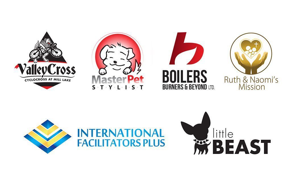
It is your vision made visible. At the core, it is one of the most important aspects of marking your presence.
A well-designed logo works on a postage stamp as well as a billboard. It looks great online as well as offline. It’s memorable and has broad appeal – it suits as many of your customers’ tastes as possible, not just your own.
No logo design is complete without an understanding of your business or organization. The logo design process starts with a discussion about what you do, who your customers are, and what your vision for the business is.
A great logo should be able to communicate your brand’s message effectively and be recognizable.
It’s about more than eye-catching images and readable font. There are many variables to consider, which is why our discovery sessions help determine what type of design might suit your visions for the company best.
f your company is looking to make an impression and grow in the marketplace, you’ll need a logo.
One Yellow Tree helps build your brand reputation and grow your audience with a professionally designed logo that fits your business perfectly.
Logo Graphics
We recognize shapes and patterns more easily than words and phrases.
If you shift the letters of a word around but keep the first and last letter in place your brain can read the text perfectly because it recognizes the shape of the word.
Graphics add an extra dynamic to your logo design.
A professional logo design ensures your logo can be used in any way without losing its quality or becoming pixelated.
From the smallest applications such as a business card or postage stamp to the largest like a billboard or on the side of a semi-truck trailer, your logo should be crisp, sharp and recognizable.

Splash of Colour
Sports teams use color to keep their players recognizable on the field. Businesses use color to stand out and be recognizable on a shelf and/or website.
Color combinations help build that recognition even more, as well as an atmosphere around the graphic. The colors your business uses in its logo can have a large impact on your company’s future business success.
Certain colors convey certain emotions and feelings. If your goal is to make your business appeal to an audience that is energetic, you may want your logo to utilize radiant and exciting colors like yellows or reds.
However, if you’d prefer the professional appeal of being cool and refined, then darker colors like blue and grey are a better choice. It’s worth noting that logo designs don’t need color to stand out.
A great logo design doesn’t lose its meaning when it’s in black or white. This is color psychology and it is linked to empathy mapping in our branding exercise.

Text Logo Designs
Text logo designs are useful for getting your company name out there in a bold way.
But being bold and legible isn’t enough. Unless your company and logo are internationally recognized like McDonald’s or Apple, adding your company’s name to the graphic design is essential to building awareness.
Words in a logo do more than convey your company’s message, they also establish a look and feel for your brand.
Great graphic designers know how to use different fonts to convey meanings and emotions.

